
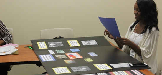
As I began contemplating the design for my poster, I first decided to include more images than text. The particular images I chose presented bold messages that I felt conveyed my understanding of Christian hypocrisy in a more creative way than text could have. Organizing the key words in the center and with bright color was to purposely draw the reader's attention there as the starting point for relaying my summary of the poster. The purpose behind including the web diagram I created was to organize my argument and research into a form that would be quick to read and understand. Consuming the larger portion of the board with images and text related to hypocrisy was my way of conveying the strong interest I have in matters of deception.


Related:
• AALCI 2015
************
************
No comments:
Post a Comment